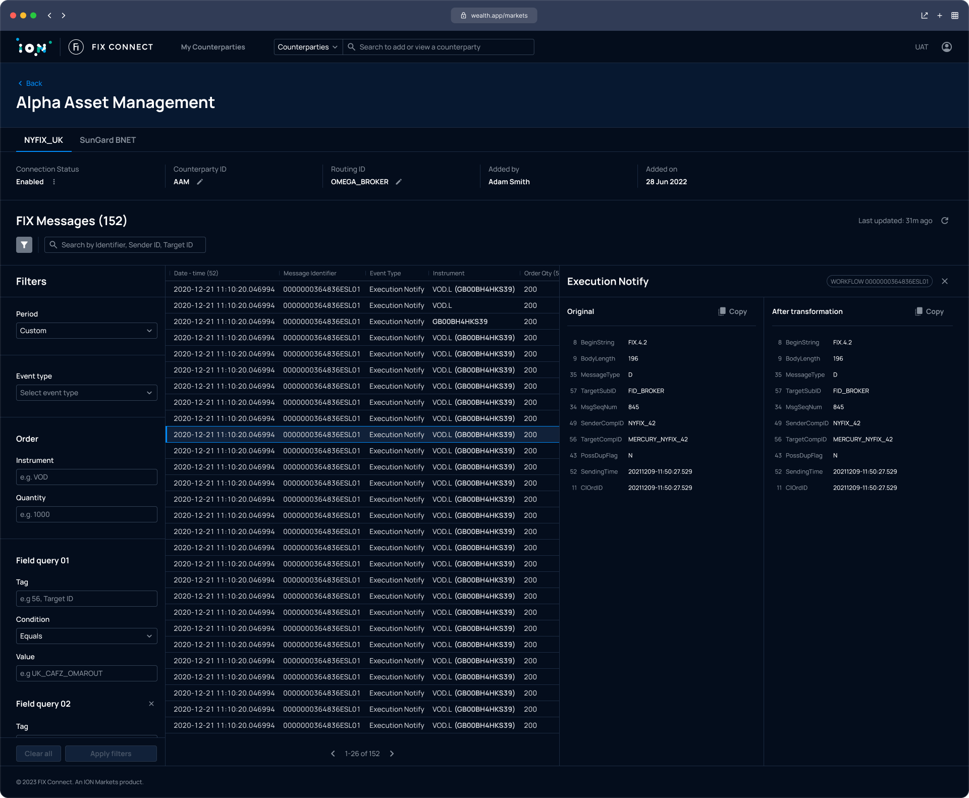
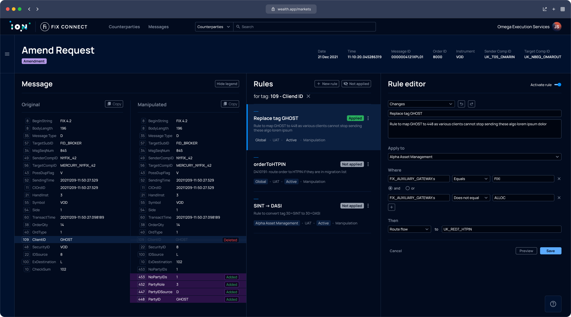
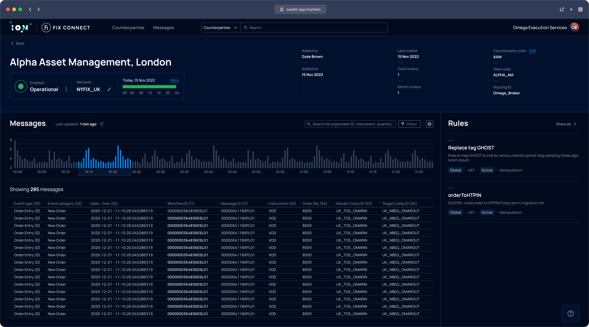
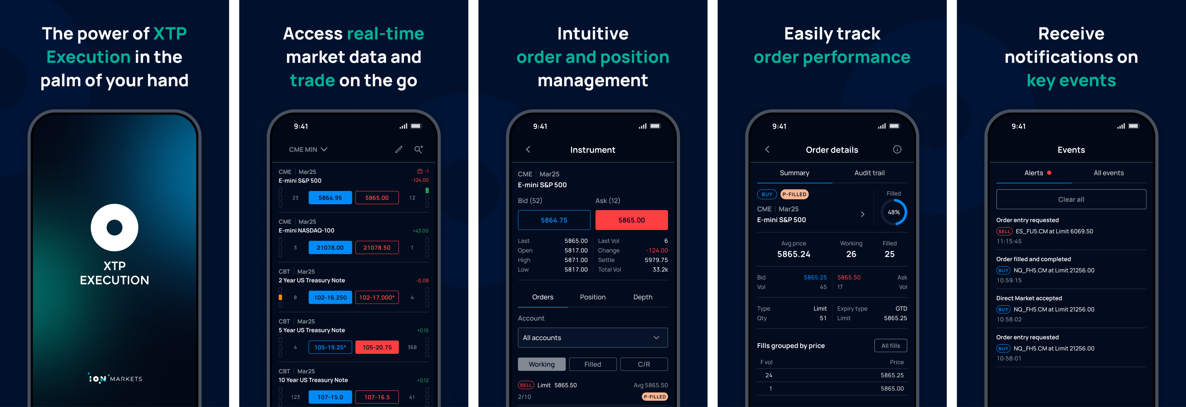
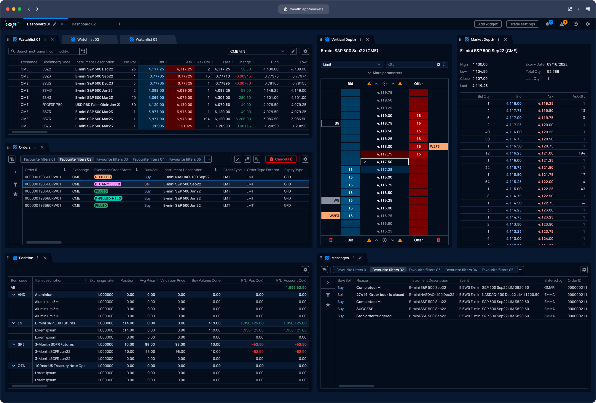
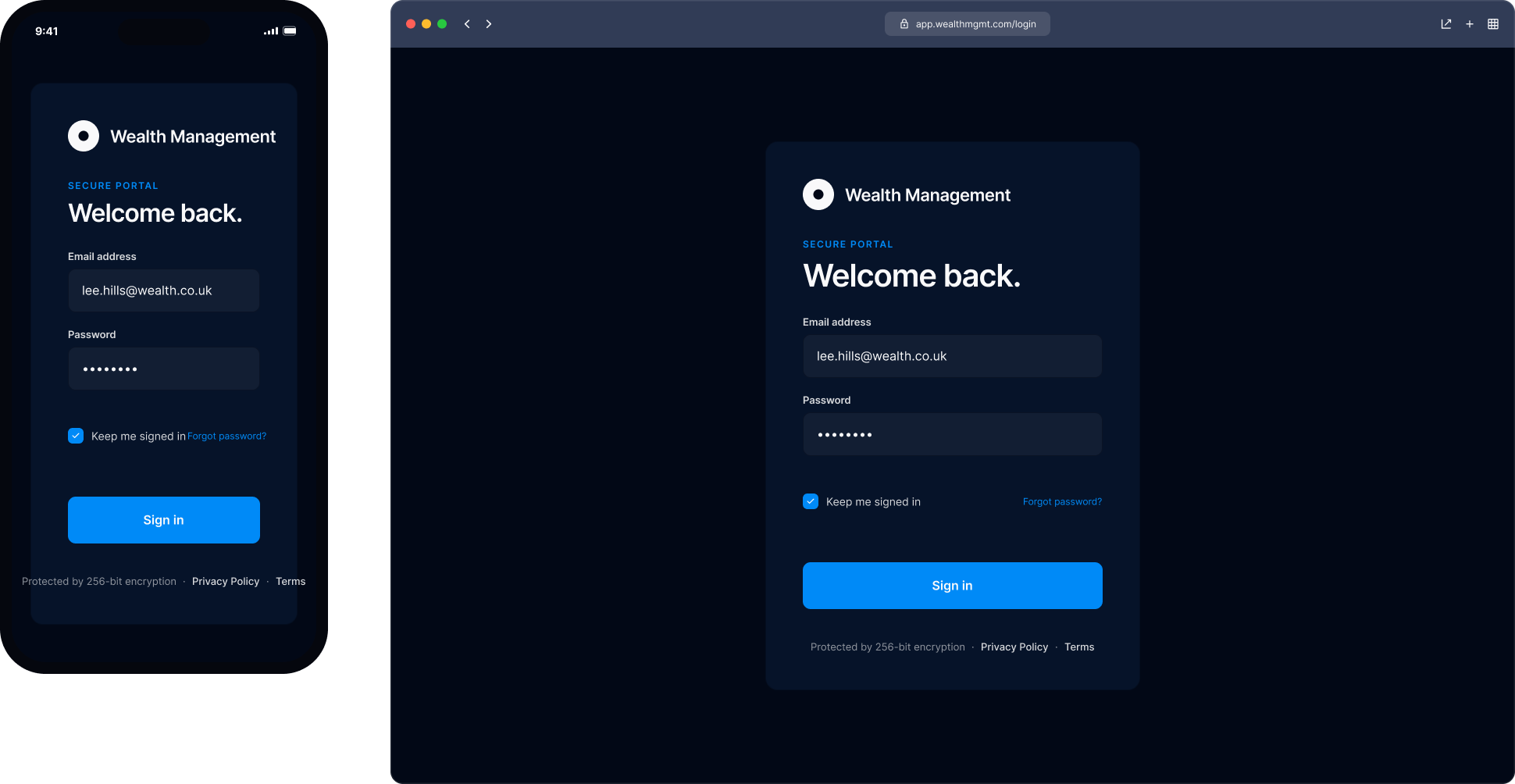
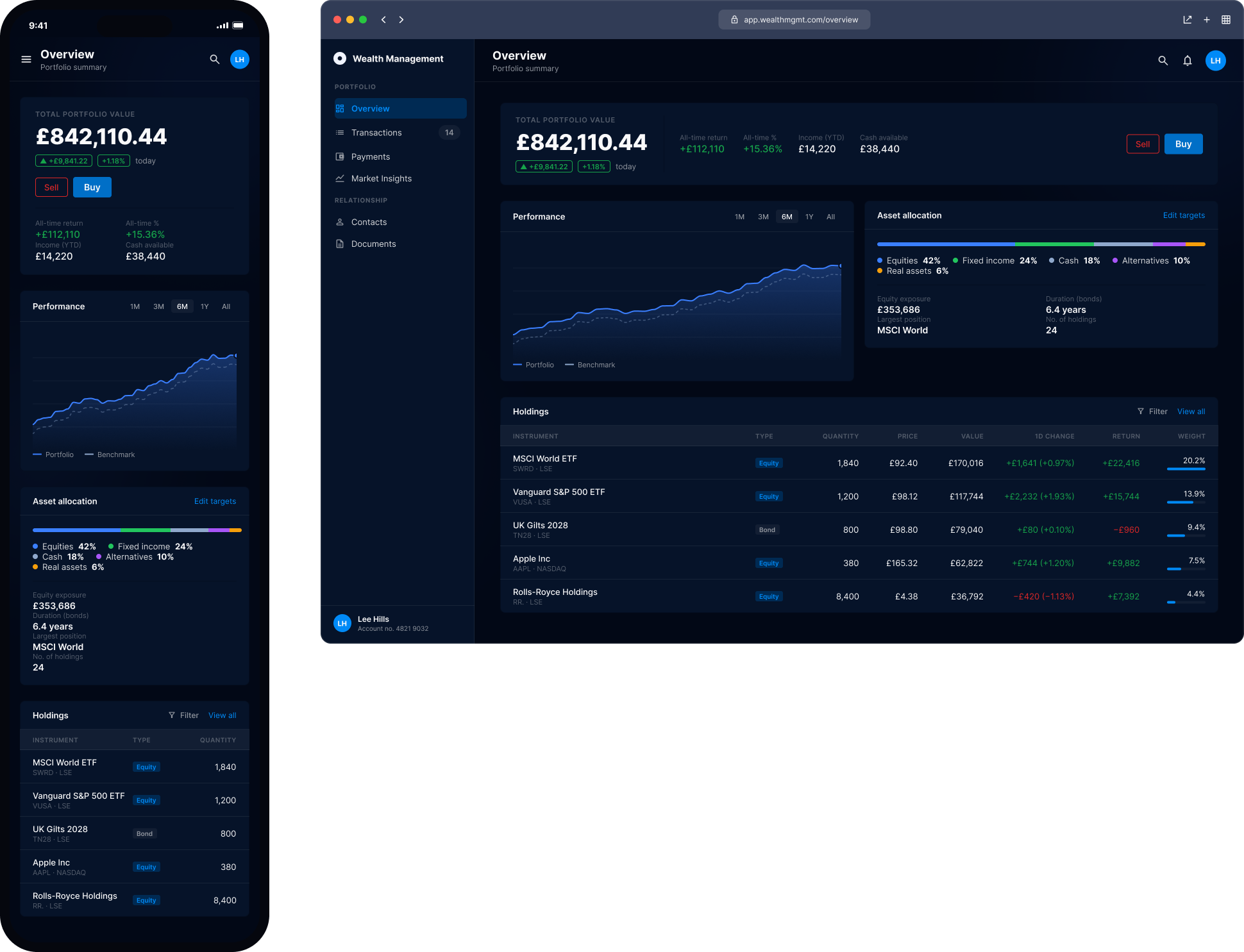
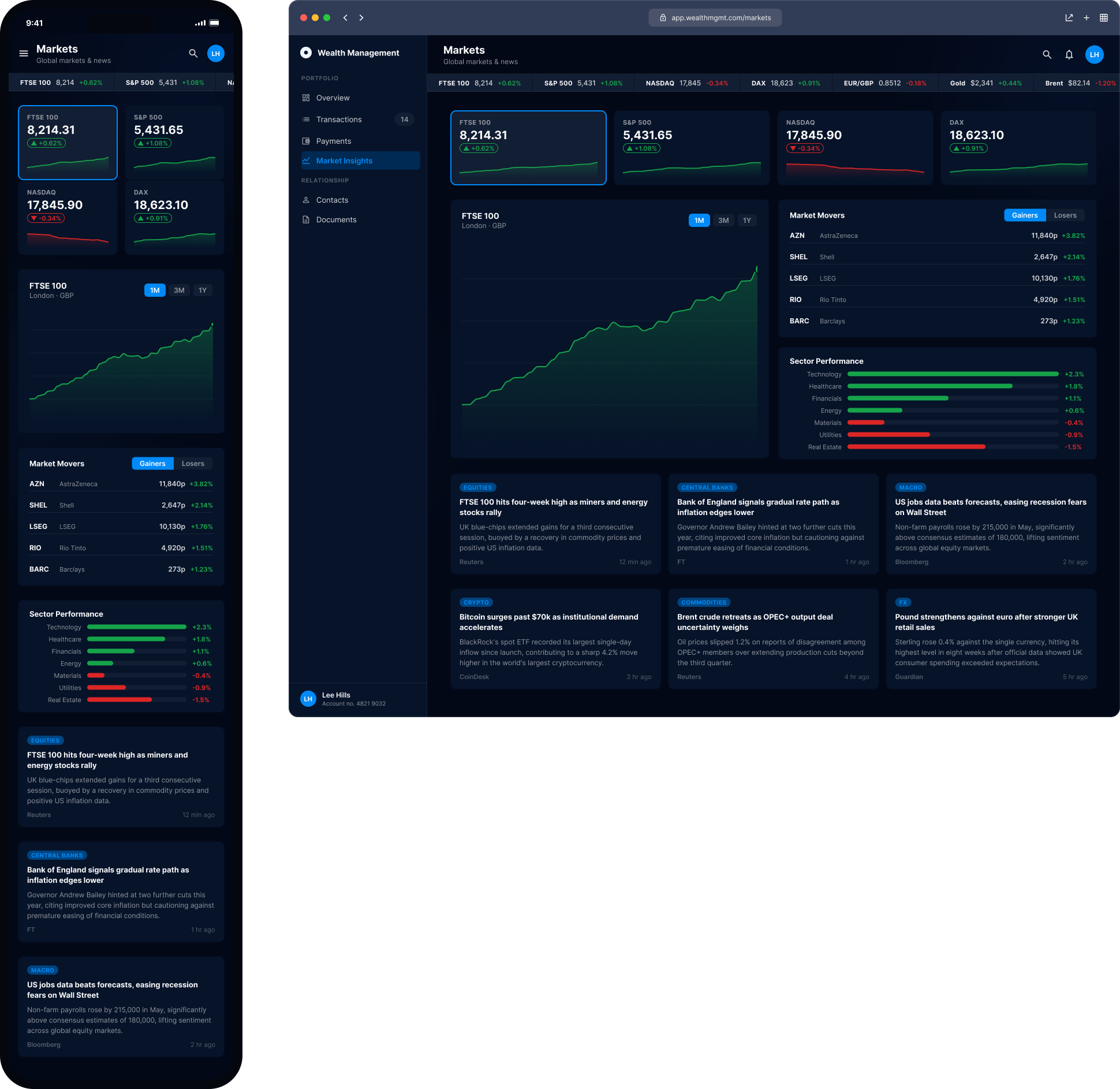
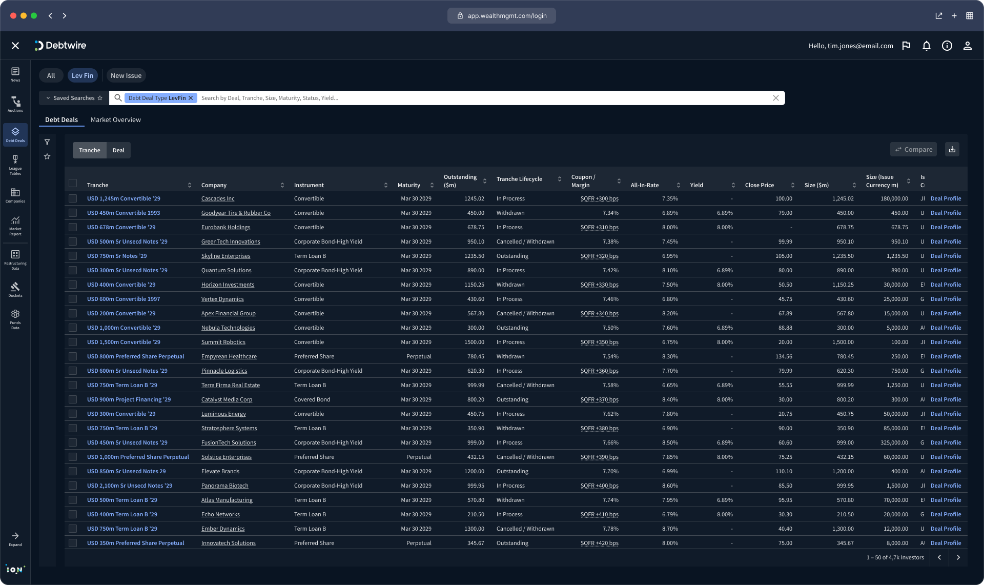
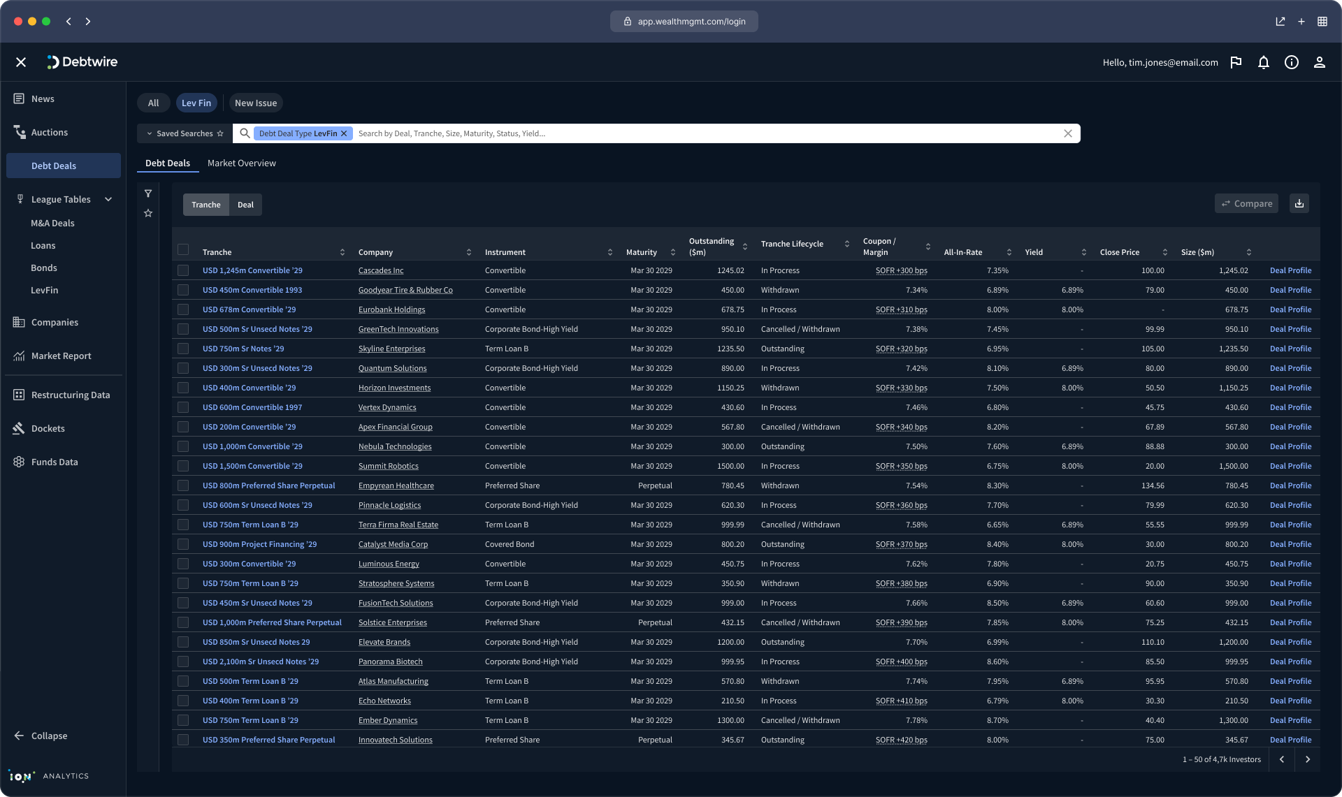
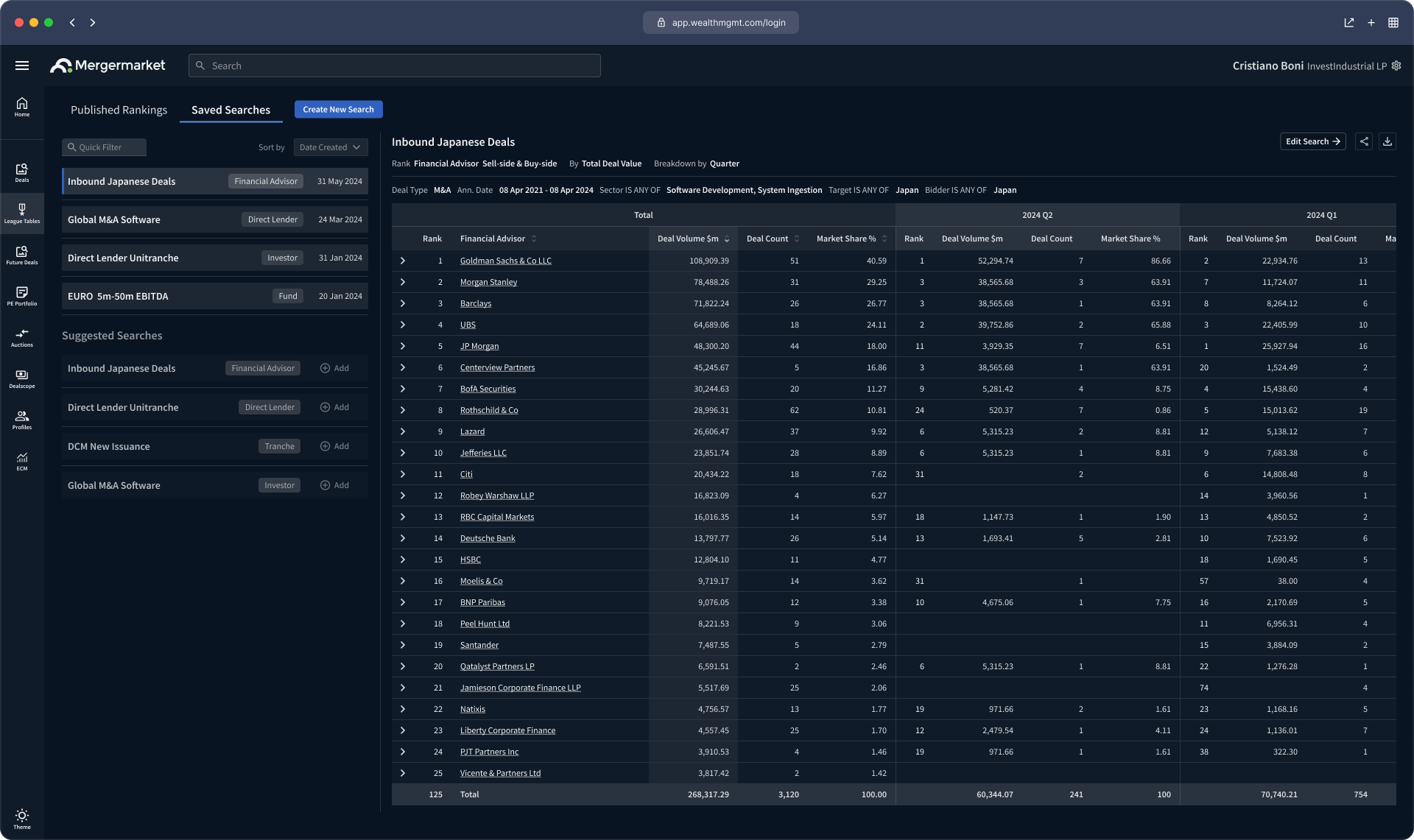
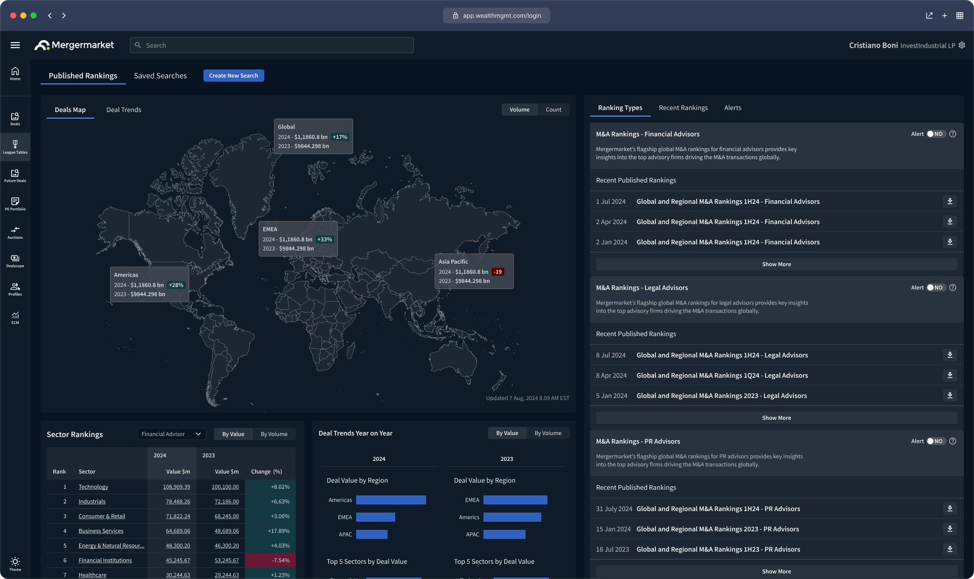
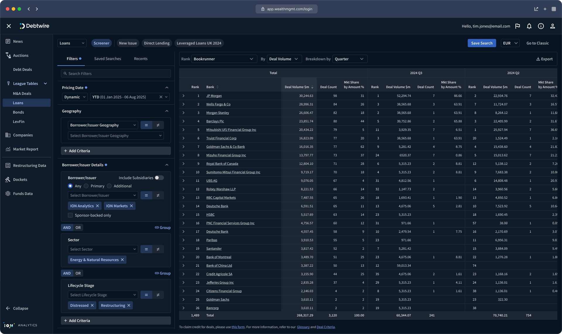
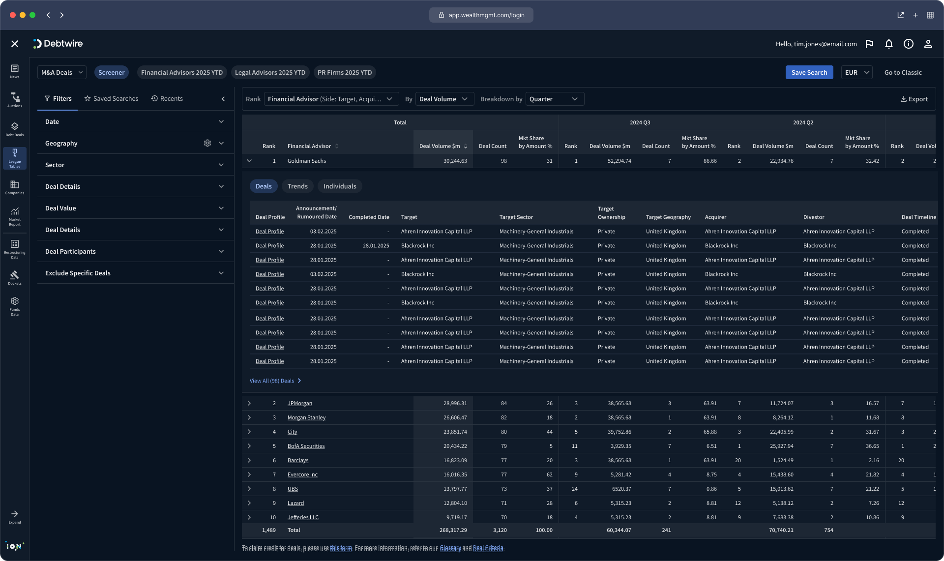
ION provides digital solutions to global financial institutions, with a portfolio of more than 200 products. Maintaining a consistent visual language and user experience across such a diverse ecosystem presents a significant challenge.
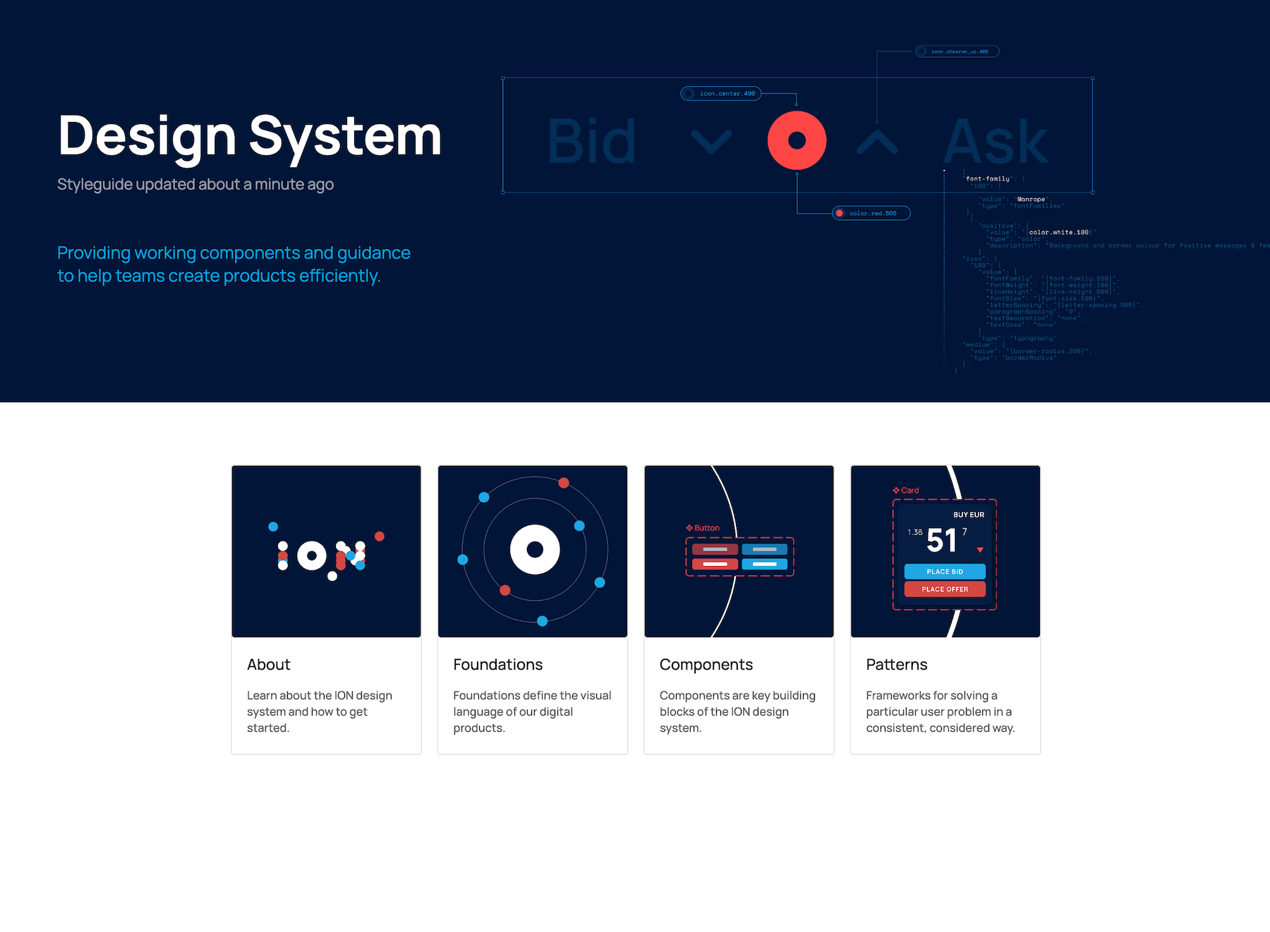
The goal was to align these products with a new ION digital identity while creating a more efficient and scalable approach to design. To achieve this, we developed design system that established shared foundations for visual design and user experience, enabling consistency, scalability and easier adoption across the product portfolio.






Designing once. Updating everywhere.
A tokenised design system gave us complete control over the visual language of more than 200 products.
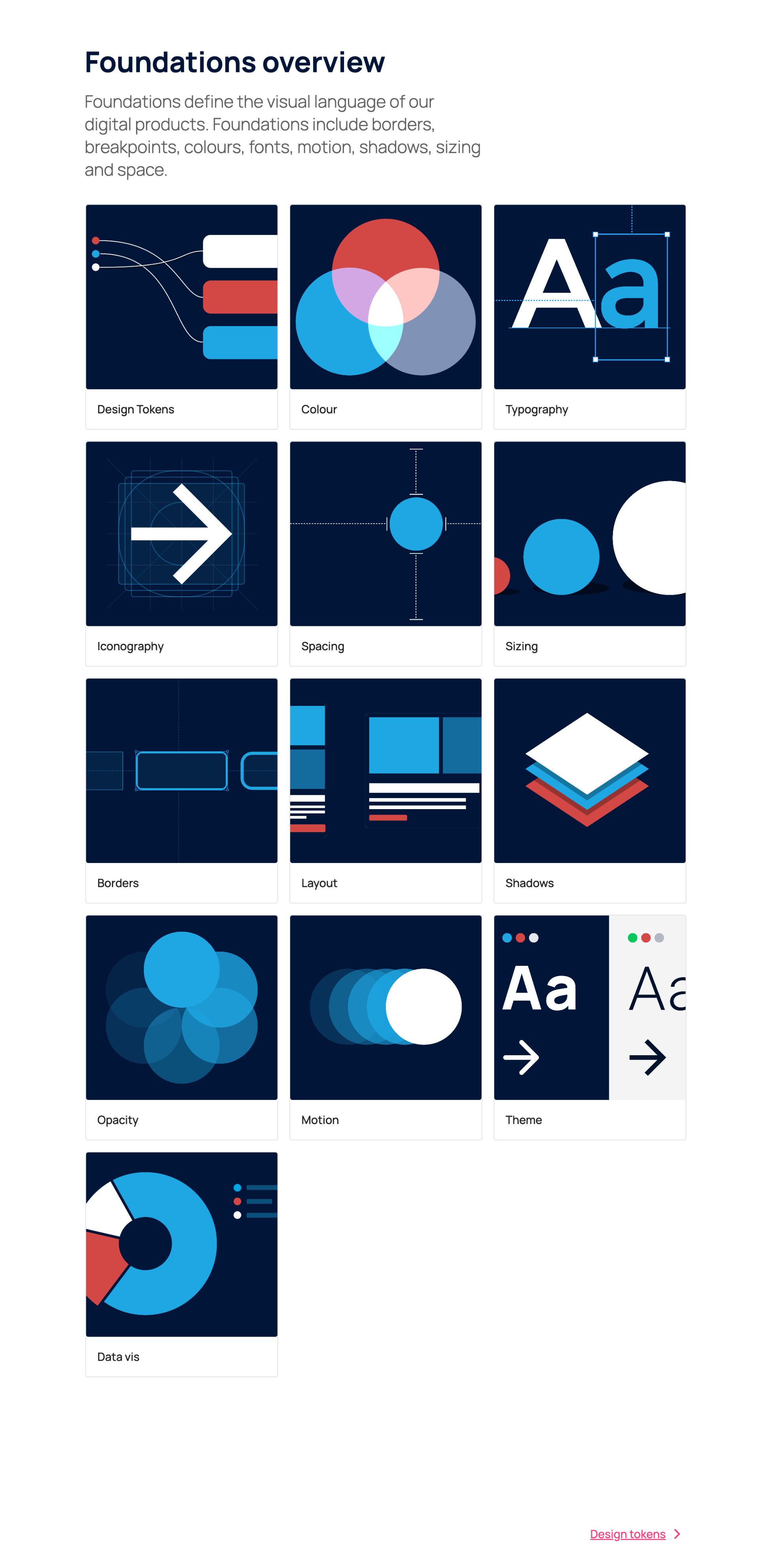
Every colour, spacing value, typography style and component property was defined once and shared across the entire portfolio. By replacing local styling with a single source of truth, we removed inconsistency, reduced complexity and prevented products from drifting away from the design system.
This transformed how the portfolio evolved. Improvements could be tested, refined and deployed across every product simultaneously, allowing the entire ecosystem to evolve together rather than as hundreds of independent applications.
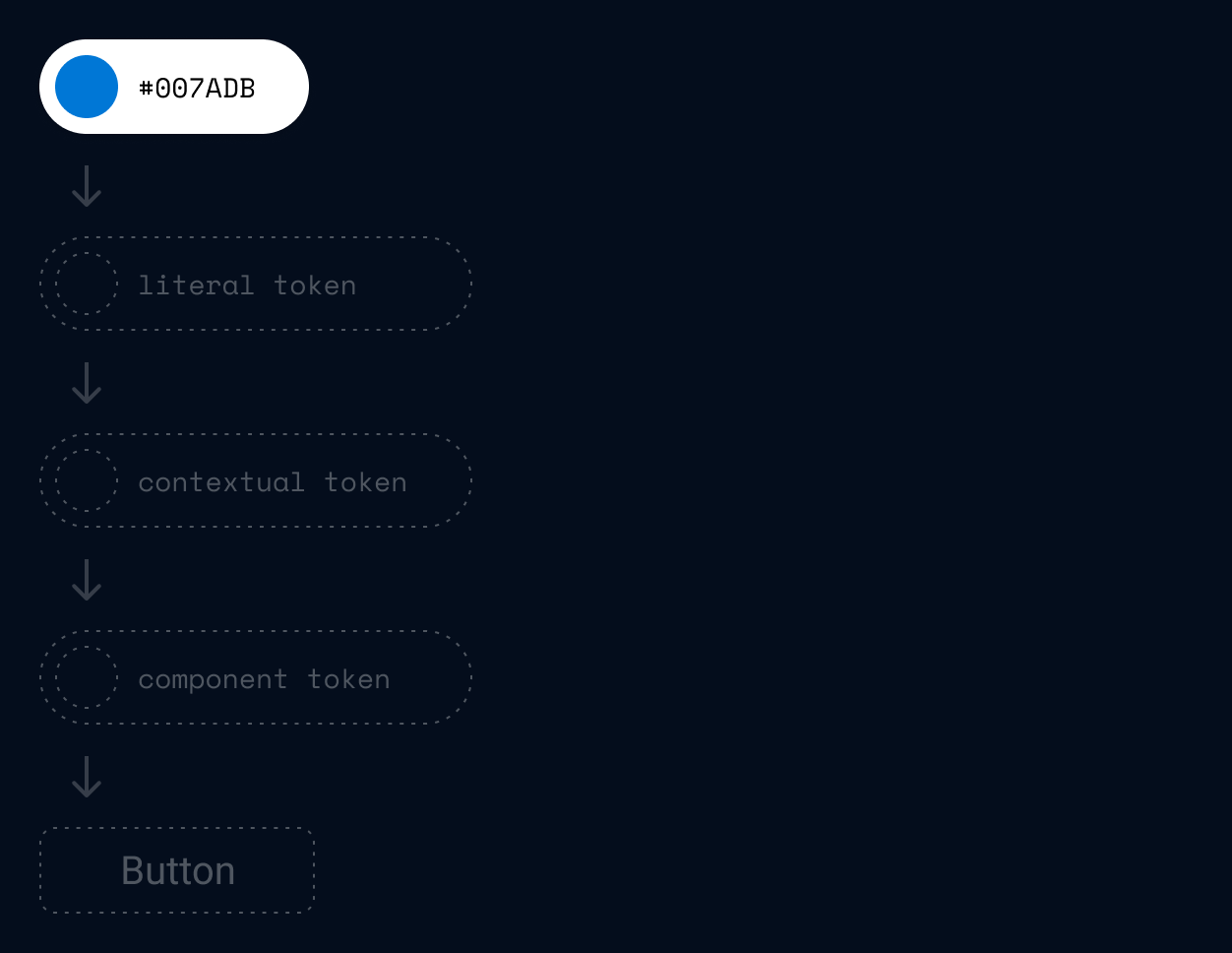
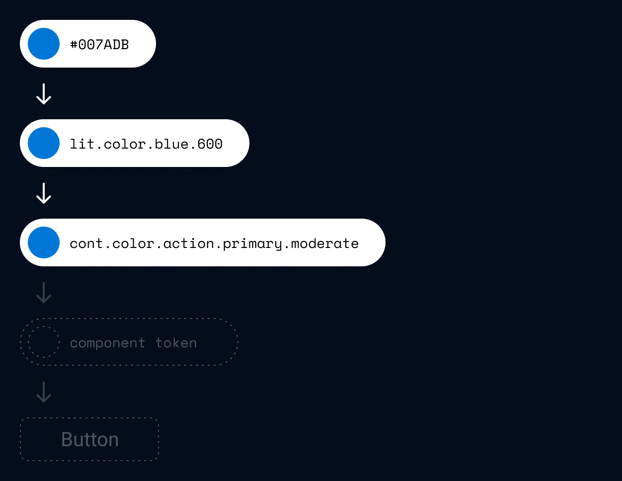
Literal tokens defined the raw design values such as colours, spacing and typography.
Contextual tokens assigned meaning to those values, allowing the same foundation to be used consistently for actions, surfaces, text and borders.
Component tokens connected these decisions directly to UI components, ensuring every element inherited the correct styling while remaining flexible enough for product-specific requirements



Design and code in sync
Every component was documented with detailed specifications that defined its anatomy, behaviour, properties and the design tokens that controlled its appearance.
These specifications became the shared blueprint for designers and developers, ensuring components were built consistently in both Figma and code using the same structure, naming conventions and token references.

Components for designers and developers
A shared component library provided designers and developers with the same reusable building blocks.
Every component was built from a common specification and powered by shared design tokens, ensuring Figma components and their coded equivalents followed the same structure, behaviour and naming conventions.
With a single library across design and development, collaboration became faster, implementation more predictable and product experiences remained consistent across the entire portfolio.

One system adopted at scale
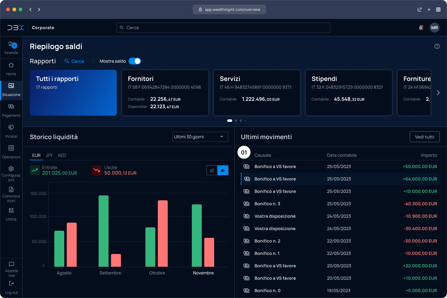
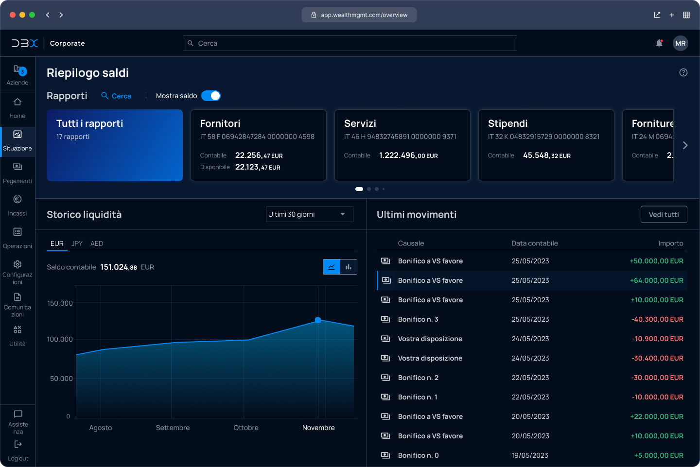
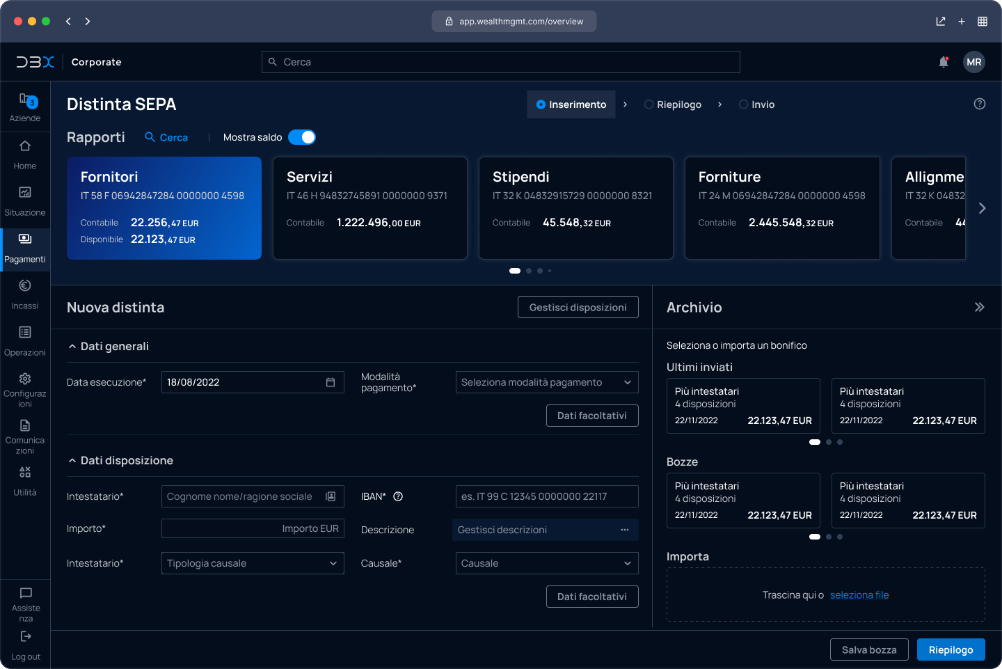
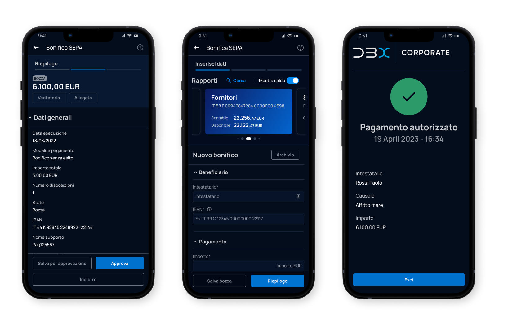
The design system became the shared foundation for the majority of ION's product portfolio, creating consistency across products while simplifying the way teams designed, built and maintained enterprise applications.
By replacing fragmented design approaches with a single, scalable system, teams could work more efficiently, improve user experience and continuously evolve products from one shared foundation.